Digital Black & White
Photography Information Index
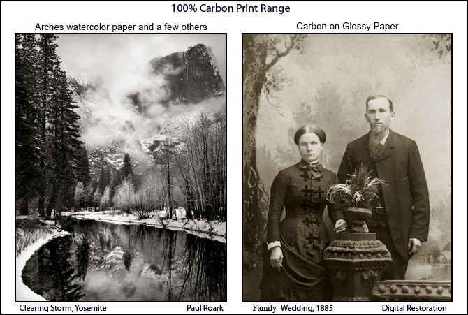
"Carbon on Canvas," 32 x 40 inches
(Carbon toned with the minimum and best cool pigments to make a neutral print.)
For my 2016-17 "carbon on canvas" project,
click here.
For information on my September 2017 show at Gallery Los Olivos,
click here, and
here.
(Note that I now seldom use canvas. Frankly, why should we photographers
use a faux-painter's substrate? I find the glossy canvas causes distracting
highlight points off of each canvas high point. Matte carbon on
Arches [for fanatics like me] or inkjet paper [recommended for most],
and mounted under museum glass or acrylic is likely
the best approach for a "fine art" print. That said, for large display
where glazing would be heavy, and where reflections may be a problem,
I most often use a roll of Red River Ultra Pro Satin paper. I always use 4 light coats
of Premier Art's Print Shield on images that are not displayed under acrylic or glass.)
Note also that links to MIS Associates pages throughout my PDFs are mostly obsolete.
MIS is simply no longer a supplier of the materials I prefer. Rather, I buy from STS Inks.
My contact there is Joseph Costello -- Joe@stsinks.com. The products I use most are
the ink formerly known as "Eboni" MK (matte black), which is "wj1082" at STS; Photo Black (for glossy
paper), which is wj1122 at STS; and "gloss optimizer" to dilute PK is wj824 at STS.
Introduction to Ink Information
Outline of current approach to B&W inkests and mixing
Shortcut: For my current top recommendation and what I use, see
http://www.paulroark.com/BW-Info/7800-9800-Glossy-Carbon-Variable-Tone.pdf.
I currently use an approach to dedicated black and white printing that uses 100% carbon pigments in
all but one of the printers' ink positions/cartridges. These carbon inks include both 100% PK andr MK and
various dilutions of the 100% carbon pigment PK. Additionally, in one ink position/cartridge I have a light
blue "toner" that is used in varing amounts, depending on printing profile, to pull the warm carbon
image to neutral. Happily, the same light blue toner works for both matte and glossy paper.
Why carbon? Because it is by far the strongest, most light-fast pigment we have.
Note that while I have informally worked with
MIS Associates for years, as well as their supplier STS Inks, I have no connection to those firms.
They have simply beem suppliers of some very good materials that I use. Currently, it appears that
STS Inks is the sole supplier of there materials.
The printing approach I recommend is the most economical, as well as most archival, that I have found.
It produces images that
range in tone for warm, 100% carbon, to neutral, but still predominantly carbon pigments.
This involves an open-source, dedicated B&W inkset that usually involves, at a minimum,
individuals loading their own cartridges and also mixing PK with clear
(aka "amber") base (aks gloss optimizer) (no scales or fancy equipment needed).
This is, in my view, today's version of the personal B&W darkroom of the silver print era. My darkroom is
now my ink mixing room. If you want the best prints, with the most personal control, and for the least cost,
this is it.
I make my profiles available, but this is not a "turnkey" approach for most printers
and papers. I publish all that I do, but I am not in the ink or profile business. I am in the
fine art B&W print "business," but it is also a passion for the medium and my
determination to keep the very best B&W printing affordable for both myself and others.
Note that I have recently changed my recommendations regarding the use of
matte carbon ("Eboni") for dilution. I now have abandoned "Eboni-6", which used to be the
best, most neutral approach. The newer MK does not have any advanage over glossy
Photo Black ("PK") in terms of making a neutral print. As such, a single, PK-based
inkset is used for everything. Again, see
http://www.paulroark.com/BW-Info/7800-Glossy-Carbon-Variable-Tone-2016.pdf
for the setup I currently use in my Epson 7800 and 9800 printers. It should work on any Epson 8-ink printer.
This does not mean that the older MK based systems are bad. It simply means that
I can use a single inkset for both matte and glossy printing. This simplifies my life.
The PK based inks may also need less frequent agitation in wide format printers than the MK based inks.
For those in France, thanks to Alain Oguse (oguse@alienor.fr), the 3880 (Eboni based) Carbon Variable Tone PDF
is available in French. See
http://www.paulroark.com/BW-Info/3880-Eboni-Variable-Tone-01-2017-fr.pdf.
A version of the glossy variable tone inkset in French is posted here:
http://www.paulroark.com/BW-Info/Glossy-Carbon-Variable-Tone-02-2017-fr_2.pdf"
click here.
Contrary to my earlier views, I have *not* found that these glossy inksets clog more
than the MK-based matte inksets. In fact, it may be just the opposite.
Universal neutral toner: For both the matte and glossy carbons we are
most fortunate that the same light blue toner can be used to make neutral tone prints.
I use Canon Lucia Blue and Cyan pigments with generic base c6b
for my printing. Third party testing indicates that the Canon Lucia EX color pigments
are the most lightfast available. The same profiles work with both the MIS blue toner
and the one I use based on Canon pigments. The
Canon based toner with carbon, particularlly on the best matte paper,
makes what I believe to be the best, most stable, neutral B&W -- more
stable than the old silver prints. But 100% carbon is, of course, even more stable.
A single light blue toner, such as those described above, is what I've found is the best compromise
between flexibility and ease of use. I have found that
very few people can master good B&W profiling of a two-color (cyan and magenta) ink system.
The best printer to start with may be the Epson 1430 (may be out of production now)
(1500 outside the USA).
(Epson's model number/designation of this 6-ink, 13", dye printer may be different today.)
While the printer is made for dyes, it works very well with pigments.
I have had 3 of this series, and they have been among the most reliable printers I've used.
That said, most of my work is with the 7800/9800. It is more like the desktop 8-ink
printers Epson sells. Most (all?) Epson printers are compatible with the inks I use and recommend.
HP and Canon printers are not; they use thermal heads as opposed to the Epson piezoelectric technology.
More detail on carbon printing and the approaches is found below.
____________________________________________________
General Background to my B&W Approaches
To update a well-known saying from Mr.Adams, "The image file is like the musical score, and the
print is the performance of that score."
We photographers and printers make and sell photographs that are a combination of 2 major components:
the image and the print.
Although, as noted above, I enjoy pushing the envelope on both fronts, a major part of my journey has been
exploring the options and refining the processes and workflows relating to the B&W print. Information
relating to modern B&W digital printing is the bulk of what follows.
In the past, we B&W photographers prided ourselves in the archival nature of our lightly selenium toned silver prints.
With the advent of digital tools, the inkjet print was, for good reasons in the early days, considered
second-rate. Most today still are if one is interested in fine art black and white.
While today's best color pigments are very good and better than the "wet darkroom" color processes,
those pigments are not up to the silver print standard.
Developing the digital and inkjet processes to achieve "silver print" class image stability and quality has been a
significant effort of mine and some other like-minded people.
Today, the best carbon pigment prints we are making from dedicated B&W printing systems have exceeded the silver print
in a number of ways, including image stability.
Just to get your attention, here is a lightfastness comparison of an inkjet 100% carbon pigment print versus a selenium-toned
silver print (fiber base, not RC). The testing was done by Aardenburg-Imaging.com.
The midtone, Lab L = 50 test patch delta-e values
(total change in density and color -- lower is better) after 100 Mlux-hours of light exposure
(about 50 years of display) were as follows:
100% carbon pigment print: Delta-e = 0.1
Selenium toned silver print: Delta-e = 1.2
That is, the carbon print was, by this measure, 12 times more stable than the silver print.
Most of this difference is in the paper tone stability of the substrates. A good inkjet paper that has no
optical brighteners can be very stable. The silver and carbon are both very stable; it's the paper that is
the weak link for the old silver prints.
The point is really to stress that with the right materials -- carbon pigments and good, non-OBA paper --
inkjet prints can be significantly more stable
than the classic silver prints. However, the materials and processes are critical when it comes to making the best
black and white prints. The higher the carbon pigment content, the better the likely stability. Of course the
desired print tone may necessitate some added color, but for stability, that color needs to be held to a
minimum and the quality of the color pigments used must be very high.
(See a screen shot of these test reports for 100 Mlux-hours light exposure
here. For the full test reports, see
Aardenburg Imaging and Archives.
)
The visual image quality of, particularly, B&W prints from inkjet printers designed mostly for color printing,
and composed mostly of bright color inks,
has also been a problem. A good, appropriately toned, B&W image is best and most reliably obtained by having a
B&W printing system that is dedicated to B&W, having carbon inks in most if not all of its channels. I use an approach
that has carbon in all but one of the positions (8 carbon inks) and one light blue pigment toner position that
offsets the slight carbon warmth when, for example, I want snow or clouds to be totally neutral white.
In short, a predominantly carbon image is best for B&W, and a printing system made just for B&W printing can make a
print that is objectively better than the old silver print technology. The need to serve the mainstream color printing
market has made the OEM systems very good at color printing, but for B&W the higher percentage of carbon used by
specialized carbon inksets, and the placement of carbon in all but one of the ink positions can provide greater quality
at considerably lower cost.
These pages document the printing approaches I have developed and used since the transition from darkroom to digital.
Ars longa, Vita brevis
(Art is long, Life is short)
Side Note on Cameras and lenses
Relating to image capture,
I am using a Sony a7c that has been modified by Kolarivision's Ultra Thin
coverglass to allow Leica M optics. For those who like small, compact manual focus
optics of the highest caliber, this makes a very good combination. One of my
most often used photo approaches is to use two focus point -- near and infinity.
The "dual focus" (DF) approach, particularly with a top wide angle, allows easily
taking and then Photoshop stacking of even hand held images that results in
a print with near perfect sharpness from foreground to background. An infinity
stop that is proprerly set is an important part of doing this easily. For beach
scenes where the waves and movement of the water on the sand would make a DF
approach impractical, a good Tilt/Shift lens is very useful. The Canon 35mm T/S
has been a favorite of mine for years.
For a set of MTF curves, mostly Leica M, that I have used in my lens selection and
journey, see
MTF lens charts/curves.
Current Projects
My 2019 theme was to unify my printing efforts behind a single, flexible, yet simple and open source inkset. See
Glossy Carbon Variable Tone inkset. From the date on this, you can see that it's been
running on my printers long enough to know that is works very reliably. I am consolidating my efforts
behind this approach because it is simply the best I've used and found.
The approach should be adaptable to all Epson inkjet printers (not thermal heads).
The papers this opens up include all glossy papers, including specifically
the popular baryta papers, as well as canvas products with a satin or glossy surface.
Matte papers are also within the inkset's capabilities if there is an MK in the printer.
Note that the glossy carbon pigments sometimes settle more slowly
than the matte carbon particles.
Note that with the 7800/9800 version of this inkset,
the toner is in the LLK position. This is because I use the Y position for a second MK. I assume people using wide format
professional printers will be comfortable with QuadToneRip. With QTR, dual MK positions are not a problem.
With the Epson driver they do limit the flexibiltiy of the system. The only reason for dual MKs in my
printing is for Arches watercolor paper, which I, frankly, don't recommend for most people.
The light blue toner is use to neutralize the warm carbon, and is a blend of Canon Lucia Blue (55%) and
Cyan (45%) pigments, then this is diluted with the generic base, or gloss optimizer, sold by STS Inks.
In reading my various PDFs, it's important to note that, as new information is developed about the materials
we use for printing, my views have changed and
may well change again in the future. As such, the dates of my various PDFs as well as my stated preferences here
need to be taken into consideration. I try to base the opinions expressed here on the latest
information available, including the findings of Aardenburg-Imaging.com, Wilhelm Research, the Digital Print Preservation
project (dp3project.org), my own fade testing, as well as many other sources.
So far, nothing has come close to the stability of carbon
as the basis for modern B&W printing.
1. "Carbon on Cotton" -- The Benchmark for Print Lightfastness
a. 100% Carbon Pigment Printing
An image composed of 100% carbon pigments and printed on high quality, cotton-based paper sets the
benchmark with respect to lightfastness, and the cost of top quality carbon pigments can be very low.
The lightfastness of a
100% carbon pigment print is multiples of that of the best printer manufacturer B&W approaches.
It's not just a minor difference. Note that the "gray" inks in the printer manufacturers' inksets are not
100% carbon. They are blends of carbon plus color pigments. I use and recommend MIS Associates'
100% carbon pigments, and there are also other competitive third party sources of carbon pigments.
Beware that some companies call their inks "carbon" pigments even though they may be blends of
carbon plus weak color pigments. There is no such thing as a neutral 100% carbon pigment ink.
Carbon pigments print with a warm tone by their nature. What is unique about Eboni carbon is that
it is capable of making more neutral matte prints than the other popular carbon ink approaches.
For those who expect their prints to be considered worthy successors to the silver (or noble metal) prints,
the issue of longevity is very relevant. For those who don't care about long term image stability, the ease
and economy of carbon pigment printing may still be enough to make the approaches I recommend worth
considering.
I generally mix my own carbon inks using the formulas specified at
http://www.paulroark.com/BW-Info/7800-Glossy-Carbon-Variable-Tone-2016.pdf.
http://www.paulroark.com/BW-Info/7800-Glossy-Carbon-Variable-Tone-2016.pdf.
b. Carbon Plus Color Pigment Blends
Blends of carbon plus color pigments are not, per se, bad inks.
That said, unless the ink blends are very carefully done, the color
inks may separate from the carbon inks. Blending is best left to
software/profiles for most people. The large ink companies can match
the pigments well, but we users can't. As such, I recommend using
100% carbon in most ink positions and then having a separate toner
that pulls the print tone to neutral. In the toner, use compatible inks
from a reputable source. Thus, while I use third party carbon, I have
use Canon Lucia color pigments to tone the carbon.
One of the most critical problems of the third party blended carbon inks is print tone
shifting in very long term display, often to greenish, as one color (magenta) fades more quickly than the other (cyan).
See, for example,
this comparison of a 100% carbon print versus a typical third
party blended carbon plus color inkset after 140 Mlux-hours of light exposure.
So far, the best color pigments for toning carbon appear to be Canon's. That said,
HP's approach with its Z3200 PK, LK and LLK appears to have been to very carefully match
the fade rates of the colors it uses in those blended inks. Fade tests of its
Vivera inksets have shown impressive resistance to color shifting. Thus in several
inksets, I have used the HP neutral/cool gray inks. For a single-pigment, neutral print,
the HP pigments are hard to beat. I've had success dilution them with either the generic
base of MIS's amber base. That said, I prefer a variable tone approach.
In my current variable-tone inkset approach I focus on finding the best color inks
to "tone" the warm carbon to neutral. This search has caused me to select
Canon Lucia EX blue and, now (toner v. 2)
the Canon Lucia Cyan (actually somewhat bluish itself) pigments for the toner.
The hue angle between them is only 50 degrees,
as opposed to the typical hue angle of 120 degrees that separate the C, M and Y inks
in the typical color inkset.
See
http://www.paulroark.com/BW-Info/LAB-color-wheel-2.jpg
for a visual description of the strategy behind this approach.
With this smaller hue angle difference, less color is needed to offset the slight
yellow tone of dilute carbon, and any
differences in fade rates of the color pigments will have much less impact on the image.
The reality is that most inkjet papers will probably fail before the carbon
image fades. It is the color pigments that are the weak link.
As such, having a small amount of the highest quality color inks makes
the most sense if long life is an issue. While 100% carbon is the ideal,
most want a neutral print. On the other hand, 100% carbon
on Arches watercolor (not inkjet) paper should outlast all of the inkjet prints, as noted below.
Arches can be printed with 100% carbon and still have the appearance on the wall of a
neutral B&W print.
c. The Paper Used is a Critical Factor
One of the great advantages of inkjet printing is our ability to independently select the paper
that best fits the style and look we prefer. Again, of course, there is no one paper that is best
for all purposes. The choice of paper also can affect the expected longevity of the print.
My preferences are currently for matte where the print will be displayed under glass or acrylic, or
is expected to last a very long time. However, for cards, brochures, and display prints where looks
and cost are more important than longevity, I currently (2018) use a satin paper and display it with
no glazing (acrylic or glass) to interfere with the beauty of the image by itself.
Frankly, most purchasers care about the image, not the theoretical longevity of the print.
Nonetheless, I always at least spray the prints I sell with Print Shield to give them some
protection from water, fingerprints, and the like.
Acid free and buffered paper is needed for any print that is expected to have a long life.
Lignin in paper made from wood is typically the source of acids in cheaper paper. Even if there
is sufficient buffering in the paper to absorb the acids formed by the breakdown of the lignin,
the lignin itself will yellow the paper.
Cotton-based paper is often considered the best, in part, because cotton is virtually lignin free.
However, without buffering in the paper, air-borne acids will still attack the cotton fibers.
This is what I've seen happen to my well-processed wet darkroom prints that were stored in a
manner that allowed air-borne acids to reach them.
OBA's (Optical Brightening Agents) are dyes added to papers that convert UV into
visible light and make the papers appear brighter. They are widely used even in cheap
"plain" papers made for copying and text printing. However, not only will the OBA dyes fade,
causing the paper to warm, but they
also appear to be implicated in reactions that will cause staining of dark stored prints.
This issue is under-reported in the materials and testing most photographers rely on. The
best explanation I've seen is that of Mark H. McCormick-Goodhart, Director,
Aardenburg Imaging & Archives, in his August 29, 2015, comment on the
Luminous Landscape forum, near the bottom of the page.
The bottom line for OBAs is to avoid them for prints desinged to last a long time.
Good, deep blacks are a characteristic I, like most B&W photographers,
expect in a top quality B&W print. Here, I have found and
verified with one-degree light meter readings that the best matte papers often have a deeper black than do the
glossy papers when both types are displayed indoors, on the walls, under glass/acrylic
in normal office and home environments. However, when the glossy or satin paper is displayed without
any glass/acrylic over it, the greater dmax of the glossy paper type can give a print a significant advantage.
It's all about the display situation and reflections, balanced against other factors like preferred style
and degree of protection of the image.
The amount of color needed to neutralize carbon warmth tends to be least with matte
papers and most with glossy papers. My favorite natural, un-coated
paper -- Arches watercolor paper -- tends to make a relatively neutral print even with
100% carbon. (Profiles can be made to use the inks in a way that allows a 100% carbon
image to have a maximum warmth over the paper base of only 3 Lab B units.)
Glossy papers tend to print a light yellow -- half way to sepia -- tone
with just carbon. As such, they require toning with color pigments to achieve
a traditional neutral B&W image.
Physical deterioration of the paper is a factor that is not well tested.
While it is likely that an image composed of
100% carbon would outlive the paper base, finding objective data on the relative expected
longevity of different paper types is difficult.
The coatings and laminations on inkjet papers appear to be the
most likely to cause problems. Differential expansion and contraction caused by humidity and temperature
fluctuations tend to crack and separate laminated paper substrates over time. These factors are
not being tested in popular long term storage testing protocols, where humidity and temperature
are kept constant and not cycled. Historical evidence is probably our best guide.
See
http://www.dp3project.org/preservation#crackinginkjetlight
for the Digital Print Preservation Project's look at cracking of inkjet coatings.
See also
http://www.luminous-landscape.com/forum/index.php?topic=87926.0
for a comparison of how different types of inkjet paper did after 6 months of sun
exposure through a window. Both of the tests, above, involve treatment of the
paper that no one would subject a valued photograph to, but they probably also
indicate what will happen eventually to these coated papers.
In the past, the photographic "RC" papers had the worst reputation. The extent of that reputation that was due to
specific photo paper characteristics as opposed to the nature of that type of laminated substrate is unclear.
In my own old photo digital restoration work, I find what I call "micro-cracking" of the emulsion rather typical
of many of the oldest photos. This surface deterioration is often the limiting factor in pulling information
off the old prints. Some conservators have opined that all coated or laminated substrates will eventually
crack and/or delaminate.
Arches un-coated watercolor papers have an outstanding reputation in the painting world, where they
have been used for hundreds of years by artists. And they can make excellent
carbon pigment B&W prints. In general Arches is not quite as smooth as coated inkjet papers, but more than adequate
for large display prints. Note that the backside of the paper is much less likely than the front side
to have fibers sticking out of the surface. While there are other high quality watercolor papers, Arches
achieves the highest dmax (deepest blacks) of any un-coated paper
I've tested. In fact, Eboni v. 1.1 achieves a dmax that is better than the
vast majority of inkjet papers with OEM MK.
With no coatings or laminations to crack or flake off, these
un-coated watercolor papers are likely to age much better than coated inkjet papers.
While I suggest this paper as a benchmark, and I use it, uncoated watercolor papers require special
workflows and inks to make good images. They are not what I recommend for most people. There are many
very good inkjet papers. The best matte papers look excellent and will last a very long time with
proper handling and display. I note and profile many of these in the various PDFs
I have posted on printer and ink workflows.
2. Claria & Epson-Noritsu Advanced Dyes
"Life is short," and for current enjoyment,
B&W dyes with the highest quality image files can be visually beautiful.
On the other hand, as the saying goes,
"art is long." Museums and art collectors should prefer carbon pigments for the images.
Carbon on cotton-based papers are the only medium that may look visually unchanged
after a hundred years of display.
These are two separate B&W photographic media for different aesthetics and markets.
While the B&W dye print on my office wall looks good after 3 years, I know from having
taken such a display print out of its frame after a few years that the dye images
change significantly over a period of only a few years of display.
Note also that B&W images made with dyes can display color shifts when viewed under
different lighting conditions. This was mostly a problem with old-style fluorescent lights.
Older lights with Color Rendering Indices (CRI's) of less than 80 may result in a
green/cyan tone shift that is significant.
I have made B&W profiles for the Epson 1400 and its OEM Claria inks, using QTR, and
have outlined my recommended approaches in a PDF at
http://www.paulroark.com/BW-Info/1400-Claria-BW.pdf.
______________________________________________________________________________________
Other Inkset and Workflow Links
Inkset List by Printer and Inkset Name
For a list of inksets I've made for various printers, click here. This list includes some inksets that are fairly new and that I would still recommend. It also
includes some legacy inksets that were made before we knew as much as we do now about ink longevity and
might not recommend today.
Workflow Notes;
"Carbon on Cotton" for best image stability and low cost;
Digitizing B&W film negatives;
Why Dyes;
MIS 100% carbon pigment inksets;
-- Eboni-6 for smoothness;
-- Eboni-6 details, including for the 1400;
Ink Mixing, including for Carbon-6, HP, and dyes; for former darkroom workers and others so inclined;
High Sierra Workshops at the historic Golden Trout Camp;
Paul's Gallery and Home Page
For my gallery of B&W photos and other information not related to the above inksets,
click here.
Paul Roark
Solvang, CA, USA
www.PaulRoark.com