Adjusting Monotone Photoshop Curves for
Inkset Control
By Paul
Roark
4-9-05
This
is written as a tutorial to help people learn to control B&W inksets by
adjusting simple grayscale curves in Photoshop or Picture Window. I assume PS CS. I use the UT-FS inkset as an example, but the
basic approach is broader. The
traditional quad partitioning curves as well as the variable-tone inkset curves
are mentioned and compared.
Because
I think the monotone curves may also be useful as overlay curves for fine
tuning variable-tone curves sets (in layers), I may migrate to a variable-tone
layers system that uses a curves set with grayscale overlay included for
purposes of matching the print density to the monitor or other reference.
Photoshop Image Adjustment
Curves
While
controlling an inkset using only the Epson OEM print driver is easy and
convenient, more control is possible with Photoshop’s image adjustment curves.
To see how this can work, open a grayscale file and navigate to
Image>Adjust>Curves. A curve panel will appear.
Curves
are used to edit the distribution of information in an image file. They change
the relationship between input and output values. With grayscale images this
typically includes changes in density (how light or dark the image appears
overall) and contrast (the relative difference between tonal values in the
image). We can also use curves to control how image information is sent to the
individual inks in a printer.
The
horizontal axis in the curve panel is the input value of the file; the vertical
axis is output value. The default 45-degree line indicates the default
relationship each input value has to a corresponding output value. The
relationship between values is linear until an edit is made.
Click
on the center of the curve and the Input/Output values appear. In the example,
these show an input of 127 and an output of 127, corresponding to the edit
point. However, if the curve is moved up the output changes to 191 and the file
becomes much lighter. All values that were 127 (50%) become 191 (25%), and,
importantly, the program smoothes the curve between points. The end points have
not changed (black is 0, 0 and white is 255, 255) but the new midpoint position
has altered the other input and output relationships along the curve.
These
curves are very useful tools for controlling quadtone inksets. One potential
problem for some photographers is the high cost of Photoshop. It is, however,
the industry standard and most serious printers will want to take the plunge at
some point. Fortunately, Digital Light and Color has an alternative image
editor for PC’s called Picture Window that is compatible with Photoshop curves.
Additionally, Photoshop Elements includes layers and there is a procedure for
using curves on layers. These alternatives make it possible to use curves to
control inks with or without the full Photoshop program.
Monotone Inkset Curves:
How
Photoshop curves are used varies depending on whether the quadtone ink set is
monotone or variable-tone. With monotone ink sets, like MIS’s UT-FS (warm) and
UT-FSN (neutral), the tone (“colorcast”
or “hue”) of the image is fixed by the ink and paper combination. The curves
will not change the print tone but will have a major impact on the density and
contrast of the print.
Even
if the inkset is monotone, however, there are differences between the older
quad (4-ink) and newer hextone (6-ink) printers. Due to the relative ease of
adjusting monotone inksets on modern hextone printers, they are a good platform
for learning about curves. However, because many photographers are still using
4 ink printers I’ll first look at what is required to use them.
Traditional Quadtone RGB
Curves
(Some
may want to skip to the next section.)
Quadtone
ink sets allow us to achieve smooth grayscale prints by combining black ink
with three gray inks. Older four ink printers, like the Epson 3000, produce
large, non-variable ink dots. Additionally, they lack the light color ink
positions (light cyan and light magenta) found in modern hextone printers. The
early PiezographyBW and MIS FS quadtone inks used the following ink order: C-
dark gray; M- medium gray; Y- very light gray. Hextone printers still use these
ink designations but the inks are installed at different positions in the
printer.
Ideally,
one would like to use CMYK curves to fully control a printer; each ink position
would have a specific curve to control its output. However, the Epson driver
only accepts RGB image files. If a set of CMYK curves were used the print
driver first converts the data to RGB and then converts it again to CMYK.
Control is lost in the translation.
To
print an older quadtone inkset with curves, the grayscale image file is first
converted to RGB (Image>Mode>RGB). This approach is also used for the
newer variable-tone ink sets and for glossy papers with monotone inksets. In
practice, RGB curves do a good job of controlling the CMY inks. The RGB curves
control their complementary colors:
- The Red
curve controls the cyan-position ink,
- The Green
curve controls the magenta-position ink, and
- The Blue
curve controls the yellow-position ink.
There
is no direct black ink control with this approach. However, the print driver
limits the color inks and will substitute black ink when it sees the color inks
approach the black point. This allows for indirect control of the black ink
through the curve authoring process.
The
RGB curves are used to partition the quadtone inks; they instruct the printer
to use the light inks – and only the light inks – for the light tones, the
medium gray inks for the medium midtones, and the dark gray inks for the darker
midtones.
RGB curves set for Epson
3000 and a traditional quadtone inkset
To
get the black ink to turn on all curves must converge to the black point. The
light and medium gray curves start to resemble roller coasters. Producing
smooth “crossovers” where the curves overlap, to achieve smooth print density
transitions, can be tricky.
Authoring
these curves is complex and many users do not learn how to make or modify them.
This limits their appeal considerably.
Grayscale Curves for
Hextone Printers
With
modern hextone printers monotone ink sets are much easier to control and use.
Between their smaller, variable dots, light color ink positions, and automatic
driver crossovers, the complex RGB quadtone curves are not needed. A simple
grayscale curve will do the job. This is an approach that most will find easy
to deal with.
UT-FS
curve for 1280 and EEM
The
monotone MIS UT-FS and UT-FSN ink sets I’m supporting for the Epson 2000P,
1270, 1280, and 1290 hextone printers use the traditional ink densities, but in
a different order than the traditional quadtone printers. The hextone ink order I use is referred to as
“CMCMY.” The letters refer to the original UT-FS quadtone ink densities, but
they are loaded into the as follows: the dark gray C ink is put in both the
Cyan and Magenta positions; the medium gray M goes into both the Light Cyan and
Light Magenta positions; and the lightest gray Y stays in the Yellow position.
With
modern printers the ink dot size is so small that even medium gray ink will
print essentially dot-less. The light and medium inks can be used in the
highlights. With the dark and medium gray inks in positions where the driver
automatically partitions them, the print driver handles all the crossovers.
Relatively
minor adjustments through a grayscale curve are still needed to fine-tune the
output densities. Because this is the easiest curve to make for controlling ink
sets, it is a good place to start.
21-Step Test Files and
Target Densities
Before
getting into the details of how a curve is built one needs to understand the
test files and target densities that are indicated on them.
I
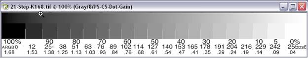
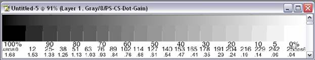
use 21-step test files to make curves. These files are sometimes referred to as
“step wedges” and can be downloaded from my website. (See http://home1.gte.net/res09aij/Test-files.htm) The test strips will have a set of
increasingly dense steps in 5% increments from 0% (white) to 100% (black). I
also label the steps with the equivalent 0 – 255, 8-bit luminance code values.
On this scale, 255 represents white and 0 is black.
A typical
21-step test file.
Papers
print with different maximum black densities. As such, the target densities
vary depending on what paper is used. I’ve made a series of test files that
have different target densities for the papers I work with. When printed the 21
density steps can be read with a spectrophotometer or visually judged to see if
they are evenly spaced.
There
is some disagreement among black/white printers as to what the density
distribution of target files should be. However, most rely on the work done by
the CIE (the Commission Internationale d’Eclairage). This international body
did extensive research in the 1930’s on how the eye responds to color and
different light values.
Among
other things, the L*a*b* color space came out of this research. The “L” stands
for luminance. CIE defines a Luminance scale from absolute black, L = 0, to
totally white, L = 100. The spacing of the scale is based on how the average
human eye sees apparently equal spaced differences in luminance. The CIE
luminance scale accounts for the fact that our eyes see logarithmically, not
linearly. We can more easily distinguish between light tonalities than dark,
for example.
If
a graph were drawn of what we perceive as evenly spaced densities it would not be a straight line. It
would be a straight line if the CIE Luminance values are used because the
nonlinearity of human vision is built into the Luminance scale. When one speaks
of “linearizing” a printer’s output it should mean that the output densities match
the relevant CIE Luminance values. This is not always the case.
To
put this in more concrete terms, the typical output from a number of Epson
printers using MIS FS inks on Epson Enhanced Matte paper ranges from a paper
white density of 0.03 to a Dmax of 1.68. This can be seen on the 21-step test
strip for a paper with Dmax of 1.68 that can be downloaded from my website.
These
density values cannot, however, be simply divided equally into a series of steps
that will appear equally spaced. For this, we use the CIE Luminance values. The
EEM paper white density of 0.03 equals Luminance 97. The Dmax of 1.68 equals
Luminance 16. If one divides this range in half, the middle is Luminance value
56.5, which equals density 0.61. That is where the 50% patch is often placed.
The other steps basically follow the Lab luminance spacing.
(Note
that the 50% density of this approach does not match the 50% density of the Lab
space in absolute terms, and it arguably should. The Lab L = 50 translates into density
0.73. The Kodak 50% gray card does match
Lab L = 50. The 50% = 0.61 density is a
historical standard I’ve been following, but it is arguable not the best, and I
may change my target. )
I
currently deviate from the “linearization” approach that places the 50% density
“half” way between the dmax (balck) and dmin (paper white) because I want to
print on any paper with the same file and have the prints look like they are
the same density and contrast. This seems to work best if the same 50% point is
used for all papers. No matter what the Dmax and paper white are, I have stayed
with the same 50% density (as would a system that put 50% at Lab L = 50). Many
RIPs do not use a standard 50% density and files may need to be altered for
each paper type used.
Making a Grayscale Control
Curve for a Monotone Inkset and Hextone Printer
The
basic process involves printing 21-step test strips, evaluating the print
densities of the steps, making adjustments to the curve used for the test (or a
new one if no curve was used for the first print), saving the new curve, and
printing a new test strip with this curve. After several iterations the test
print will have density steps that are close enough to the target densities to
be called a final curve.
Keeping
track of what printer and paper the curve is for can be accomplished in the
name of the curve. The exact settings also need to be noted. I sometimes put
this information in the name of the curve as a reminder. It is also important
that the test file has not been previously altered by a curve or profile. Save
the files before applying a curve that alters their values.
Step-By-Step Procedure
- Open a
21-step grayscale test file. For the better matte papers, the K168 version
is appropriate. Select all and copy
the test file onto the clipboard.
- For
efficient use of paper, create a new, blank (white background) 8x10 file.
These are the steps I take: File>New, OK; Double click Hand to get the
width to fill the screen. Increase
canvas size Height to 10 inches.
- Place the
first test strip on a layer at the top of the paper by grabbing the bottom
of the 8x10 and pushing it up as far as possible. Paste the test strip
into the new image (Edit>Paste). Grab the bottom of the file and pull
it down so that all the numbers are visible, but very little white paper
is showing below them.
21-Step test
file as the top layer in an 8x10 image
- Notice
three sets of numbers at the bottom of the test strip. The top numbers are
percentages that appear in the Photoshop Information palette when the
cursor is on that step and the file is a grayscale. The second row lists
the numbers corresponding to these percentages when the file mode has been
changed to RGB and the Color Settings have made Adobe RGB (1998) the RGB
working space. The numbers in the
bottom row are the target densities.
- Open the curves dialogue box (Image>Adjust>Curves). If one were to start from scratch, this could be the starting curve. It is easier to start from an existing curve for the printer and ink set involved, and for a paper that is close to the one that you may want to author a curve for. Assume a 1280 with UT-FSN inks is being used, and we want to make a curve for a new matte paper or smooth out some bumps in the current setup.
- Load the curve for Epson Enhanced Matte, the 1280 and the UT-FSN inkset. (Load>Highlight EEM-1280-FS-GS.acv>Load). A curve with points on it should appear in the Curves dialogue box.
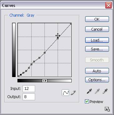
Grayscale curve for 1280, UT-FS, and EEM
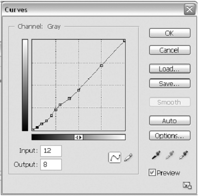
- The keyboard is the easiest tool to navigate to points, as opposed to the cursor: Ctrl + Tab highlights the points from left to right, and. Ctrl + Shift + Tab highlights the points from right to left on a PC. Note that the curve panel has two display modes. The arrows in the bottom, horizontal axis switches between these modes. I use the mode that uses the 0 – 255 scale because it allows finer adjustments (more integer steps than the 0 – 100 mode). In the 0 – 255 mode the graph’s axes are dark at the lower left. To darken a point, move it down. As one moves from point to point, notice that I put the curve’s points on the steps’ input values. Compare the numbers in the Input box with the 0 to 255 values used to label the 21-step test file.
- Apply
this curve to the file and click OK.
- Print the
test strip on the paper for which you want to refine this curve
(File>Print with Preview). The settings used to print this must be
noted and be consistent. I have a number of Readme files for different
printers and ink sets listed at http://home1.gte.net/res09aij/index.htm. The Readme file for the 1280 and
UT-FSN ink set is at http://home1.gte.net/res09aij/1280-FS-Readme.htm. Settings include the overall
Photoshop Color Settings (Photoshop>Color Settings) and the driver
settings, which are mostly on the last Properties box of the driver. The
Color Settings includes Gray Gamma 2.2, as seen in the Print preview,
Color Management Source Space. The Print Space there should be Same as
Source.
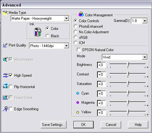
- Go to the
print driver’s Advanced panel (Printer > Properties > Custom >
Advanced).
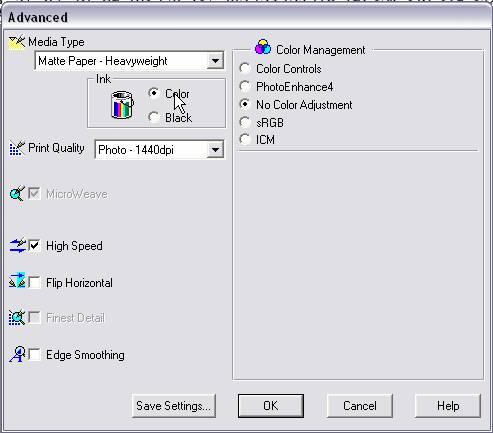
Advanced box for 1280; settings for UT-FS ink
on EEM paper.
- For matte
paper I usually recommend Media type to set to “Matte Paper –
Heavyweight,” Ink is Color, Print Quality is set to Photo-1440, High Speed
can be checked, Color Management must be No Color Adjustment (saving these
settings saves time and avoids mistakes). I always print a Nozzle Check
(on the Properties Maintenance tab) on plain paper before I do any serious
printing. Print the test strip.
- While the
test strip is being printed move the existing image of the test strip up
with the hand tool until the bottom has just disappeared from sight. Then
delete that layer. Paste in a new un-altered copy of the test strip to
prepare for the next step.
- Evaluate
the test strip after it is dry. I use a hair drier to speed the process.
After the test strip has been dried it may still change a bit by the next
day. However, they will be close enough to use after just 10 seconds under
a hair drier. If a densitometer or spectrophotometer is available, that is
the best way to work. Otherwise visual inspection and comparison to an
existing test strip will work.
- Adjust
each step density up or down as needed.
a.
For the new test strip open curves and load the curve used to print the
test strip.
b.
Highlight the first point. This will show 12 in the Input box. This is
95% black.
c.
Adjust the first point up or down as needed.
(1) Click on the Output box.
(2) To make the step darker, use the arrow keys
to move the point down.
(3) To make the step lighter, use the arrow keeps
to move the point up.
We can estimate how far to move a point by looking at how the last curve printed. For example, the 50% patch should have printed with a density value of 0.61. However, if it turns out that, for example, the 60% patch printed with the density of 0.61, then we know that the output value that the previous curve used for 60% is what we should use for 50%.
(4) Note on the test strip how far each
point is moved up or down. In the next iteration see how much difference that
move made. That will indicate how much of a move is needed next time.
d.
Repeat the above steps for each point.
e.
Add a new point if the test strip is off on a step for which there is
not an existing point.
(1) Highlight an end point – (0, 0) or (255, 255)
– and hit the Delete key.
(2) Place the cursor along the graph line
until the Input box shows the step number that you want to adjust.
f.
Save the new curves file with a new name. I click on the name of the existing
previous version and add a new number to the end of the name.
- Apply the
new curve and print a new test strip.
- Repeat
these steps until the print densities match the target or desired
densities.
Glossy Paper Curves
For
glossy papers there are two options with the UT-FS or UT-FSN monotone inksets.
First, Photo black can be loaded into the printer and simple grayscale curves
will control the system as described above. However, the matte black can be
left in the K spot for printing on both matte and glossy papers. Printing on
glossy paper with matte black (MIS Eboni) works because the two dark gray inks
used together can produce a very good black Dmax. To do this, the matte black
must not be used on the glossy paper.
Keeping
the matte black ink from printing on glossy paper is accomplished by converting
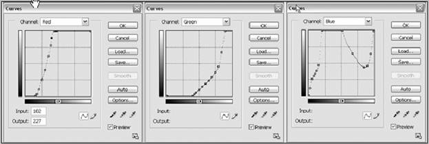
the file mode to RGB and using an RGB curves set. The lightest gray ink in the
Y position is controlled by the Blue curve. This curve is pulled down a bit at
first, but then is pushed back up to the top of the graph, thus turning off the
yellow ink and preventing the printer from using any black ink. The printer
only uses black ink when it sees that all the “colors” are being used and the
densities are very high. With the Y channel turned off at the 100% point, the
black ink is turned off as well. The combined RGB curve can contain the
adjustments just like the single grayscale curve would for matte papers. Making adjustments to a curve for glossy
paper when Eboni matte black ink is installed is just like for the matter
papers and outlined above. The Red and
Green curves can be left in their default positions.
Curves for the 1280, Epson Premium
Semigloss, and MIS UT-FS inks.
Variable-Tone Curves
The
original MIS VM ink set was created for quadtone printers using two gray inks
and one bluish toner ink to cool the print tone. The system worked quite well
but some photographers could see dots in the highlights of a print when viewed
very close up.
More
problematic was the fact that most users seemed unable to adjust the curves
themselves to profile new papers or to adjust for different ink batches or
printer variances. Additionally the inks were light and tended to flood glossy
papers, and the range of the MIS VM ink set was limited to a medium warm to
cold print tone. The next generation of variable tone ink sets attempted to
cure these shortcomings.
The
UT2 inkset for the Epson 1280 was designed to print with the OEM print driver’s
slider controls. Photographers uncomfortable with the use of curves, did not
have Photoshop, or wanted to print from another application could use the
inkset because control was in the print driver, not in Photoshop curves.
The
Epson driver sliders can control the UT2 inkset.
Using curves, however, gives more
control.
Because
hextone printers are much better than the older quadtone machines, the very
light inks were not needed to achieve smooth highlights. The lack of the lightest
inks helped printing on glossy papers and allowed an ink position (Y) to be
used for a sepia toner.
The
1280 was designed for light and dark cyan and magenta inks; light and dark pure
carbon, (warm gray inks) are put in the magenta spots, and carbon pigments that
are toned cold with blue pigments are put in the cyan spots. The printer driver
handles the crossovers between the light and dark gray inks.
While
sliders can control the tone of the print somewhat, RGB curves give the most
control. With the driver handling the
light-dark ink cross-overs, the curves are easier to deal with than the old
quadtone monotone curves. Nevertheless,
they are more complex than the monotone UT-FS grayscale curves.
With
the UT2 ink set the warm inks are controlled with a single Green curve. To
print with just carbon the curve is much like a grayscale monotone curve; until
it is time to turn on the black ink. Then the other two curves must be pulled
steeply down to the black point at the bottom left of the graph.
For
neutral prints the cool gray inks use a second Red curve. The control of how
cool or warm an input value prints is a function of the relative amounts of
cyan and magenta position inks are put into the image. So, the relative
positions of the Red and Green curves control the tone of the prints if tones
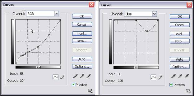
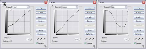
cooler than pure carbon are used. Loading a UT2 neutral curve and looking at
the Red and Green curves will help.

UT2 curves for EEM and neutral tone.
The
Red and Green curves for UT2 generally have points at 25%, 50%, and 75%. No
intermediate mid-tone points are needed; sometimes no shadow points are needed
at all. However, most will have points at the usual 5% steps from 75% to 100%.
Additionally, the Blue curve (controlling the yellow position sepia toner) must
be dropped steeply to turn on the matte black ink.
To
make a curve cooler or warmer the Red and Green curves can be edited in an
offsetting manner. While some fine-tuning may be needed, starting with
offsetting moves usually produces a reasonably good tonal ramp. For example, to
make the highlights cooler the Red curve at the 25% (191 input value) point
would be moved down, say 15 units, and the Green curve would be moved up that
amount.
The
sepia curves look a lot like the carbon ones but use the Blue curve.
While
PK can be used with UT2 for glossy paper printing, I don’t recommend it unless
the ink set needs to be printed using only the sliders. This might be the case
if a non-Photoshop application is used. As with the monotone ink sets the two
dark gray inks, in the C and M spots, produce a good black Dmax. This allows
the ink set to print on glossy and matte papers without having to change inks.
To generate the black with the two gray inks the Blue curve is pushed up to the
top at 100% to keep the black ink turned off and the Red and Green curves are
pulled all the way down.
The
general procedure for modifying curves is the same as with the grayscale
inksets, except that the tone of the test patch also has to be evaluated and
adjusted. As such, the process is more involved, and a spectrophotometer is
much more important for doing a good job.
Alternatives to the Sepia
Toner
With
the UT2 and UT7 ink sets, the sepia toner isn’t required unless one wants to
print with sepia. If one only prints matte prints in the range from carbon warm
to cool a second, light carbon ink (UT2 LM) can be loaded into the yellow
position. This makes the range of prints that can be made with the sliders
slightly cooler. It also makes slider prints slightly more lightfast, since the
sepia toner is not as lightfast as the pure carbon ink.
Another
option is putting Gloss Optimizer (“glop”) in the yellow position. For those
who do not print sepia and do print glossy prints, this is what I now
recommend. With glop the bronzing that is usually associated with glossy paper
and pigment inks can be largely eliminated. The worst papers will still bronze
to a small degree but the best papers can be virtually bronze free.
The
Blue curve becomes the glop curve. To eliminate bronzing, the Blue curve is
pulled down in proportion to the bronzing seen on the 21-step test print. It is
strictly a visual adjustment. None should be put in the 100% black spot. The
Eboni still needs to be turned off by having the blue curve all the way up to
255 at that point. Also, in the white spaces, there is little reason to put
any. If there is a gloss differential there, glop can be used to help this. It
does have some density, however, so pulling the curve down to no more than 230
of 255 is recommended. UT2 glop curves can be downloaded from my web page or
MIS.
UT2-Glop neutral curve for glossy
paper.
16 bit Grayscale Files
I
recommend scanning and editing in 16-bit grayscale mode. However, even with 8-bit
files, the print will be smoother if the file is converted to 16 bit before the
curve is applied. This is also true if the file is then converted back to 8-bit
after the curves are applied.
When
starting with a color original, even if it is edited in color, the image must
be converted to grayscale. Any residual color information will throw off the
RGB curves.
Printer Settings
When
using curves the settings in Photoshop and the OEM print driver are critical. I
begin with Color Settings (Photoshop>Color Settings). Select Abode RGB
(1998) for the RGB working space and Gray Gamma 2.2 for the Gray working space.
The
exact combinations of print driver controls will change with the ink set used,
but for working with curves you’ll always select No Color Adjustment in the
print driver’s Color Management panel. This deactivates the sliders, allowing
the inks to print at full strength. This makes the curves cross-platform; they
will work with Windows and Mac.
Once
the grayscale image file has been edited and is ready for printing, the final
should be saved. Then the file in converted to RGB mode. Then a printing curve
is applied. There are different curves for different papers and tones. They can
be downloaded from my webpage or that or MIS Associates.
The
Photoshop image adjustment curves act like profiles but they are accessible,
easily modified, and can be used without expensive software or hardware. When
RGB curves are applied the image on the display becomes brightly colored. If it
doesn’t, the image mode is wrong. Check the file and convert to RGB if
necessary. These colors simply tell the printer how much of each ink to put
onto the paper.
The
printer settings are critical. The combinations you should use are listed by
ink set and paper on my webpage. Follow these recommendations carefully. It is
also important that no other profile is tagged to the image file. In Photoshop
CS use Print with Preview so that all of the settings can be seen. In general,
the following driver settings are used for the UT2 inkset:
- Source
Space – Document: Adobe RGB (1998)
·
Print Space – Same as Source
·
Media Type – "Photo
Paper" works well for most, but this can vary with paper type.
·
Print Quality – 1440,
High Speed unchecked works well for most prints; 2880 gives marginally better
quality but is slow. For glossy papers
some might see the difference.
·
When Glop is used, 2880
is recommended.
·
Color Management – “No
Color Adjustment” is always used.
Because this setting is used, the curves should work equally well with
both Windows and Mac computers.
Once
the image is printed close the false-color file without saving it. Avoid saving
this file over your Master grayscale file.
Profiling the Display to
Match the Print
Most
photographers doing serious color printing prefer to use profiles that
calibrate their displays and printers to achieve consistent results. These
profiling systems, however, are not made to work with grayscale files and ink
sets. (Or, vice versa – the traditional
grayscale approaches have not been made to be consistent with the standard
monitor calibration systems. One could
argue this has been the real problem, and I may alter the approach outlined
here.)
Photographers
who are accustomed to the sophisticated color display profiling systems will
often say that, at a minimum, one must have a display calibrated with special
software using a sensor. I have one of those systems, and I’ve compared it to
using Adobe Gamma, which is a simple visual system included with all Mac and
many Windows computer systems. My conclusion is that the free visual systems
can be quite adequate for B&W monitor profiling. My workflow does not attempt to match the
tones (hues) of the prints. I approach
B&W as being a system that does not worry about this in the context of
working up a print. It is a separate
decision that is based on actual print, hard copy viewing in the context of
their display conditions.
To
obtain a better match between my monitor and prints, I currently adjust the
monitor view. (But, as noted before, one
could also decide to match the print to a standardized monitor view.)
To
adjust the monitor image to match the print, I use the Photoshop preview
feature/procedure described below. This procedure uses the Edit>Color
settings to make a custom dot gain curve, and saves the curve in a manner that
it can be used in a View, Proof Setup preview system that does not alter the
working space and affect the RGB values when the image is converted to RGB for
printing. Here is the procedure I use:
- Open a
file that has a good range of tones and that you have printed with the
printer & ink set you want to match. I like to use the 21-step
test file.
- Go to
Image, Mode, and Assign Profile. Check, “Don't Color Manage This Document,"
and hit OK.
- Go to
Edit>Color settings. Move it down so you can get to the top of it, but
so that it does not cover the image. Check Advanced Mode and
Preview. In the Working Spaces panel scroll Gray to Custom Dot
Gain. A curves panel will appear.
- This
curve allows adjustment of the image on the display. The idea, of
course, is to match the display image to the print. After you’ve matched
the two name the curve in the space at the top of the box and hit
OK. The curves box disappears: you see the name you just selected in
the Gray Working Space line of the Color Settings panel
- Click on
this new name in the Gray menu. Click on Save gray and the curve will
be saved as an .icc file.
- In the
Color Settings panel, which should still be open, hit Cancel. This will
leave the other working spaces as they were.
- Go to
View>Proof Setup>Custom. The new curve should be in the list
(probably at the bottom). Select it and check Preserve Color
Numbers. Click OK.
You
can also record a Photoshop Action so that the preview/display profiling steps
become a simple, single-keystroke function (for example, function key 2 on a PC
can be designated to apply the preview). To record an Action click the
Actions pallet tab. Then click the upper right arrow to start recording. Select
the function key and click on View>Proof Setup, etc. as above, then click
the Actions pallet upper right arrow and stop recording.
That’s
it for now.
Enjoy
the journey.
Paul