Photoshop
Elements 4 Notes
Paul Roark
1-21-06
Photoshop
Elements 4 has most of what B&W photographers need in an image
editor. While the full Photoshop (“PS”) versions are more powerful, there
are advantages to Elements in terms of simplicity and, of course, cost. (I purchased mine on eBay for $50 and
received a cheap digital camera with the package.) I’ll be assuming
Elements 4 is the program most users will start with. The discussion below assumes the “Edit and
Enhance Photos” option on opening has been pushed. Full Photoshop users, who are probably more
experienced, will find there are similar controls in that program.
The main advantages of
full PS for B&W printers are its image adjustment curves capability and
greater 16-bit file handling features.
Both of these limitations have work-arounds
that are reasonable and perhaps even beneficial as learning tools.
Here,
I’ll cover a few topics of interest to Elements users, including how to obtain
some of the advantages of the full PS program without having to buy it. This is not meant to be a full tutorial. I use this page as a place to make comments
where I think they are particularly useful to B&W photographers using
Photoshop Elements.
Index:
A.
Color Settings
B.
Curves
C.
Duplicate Image Cloning
D. 16-Bit Files
E. Embedding Custom ICCs
A. Color Settings
Color space settings affect how the image is displayed on
the monitor and, in a color managed workflow such as when an ICC is used, they also affect how the image is printed. They
do not alter the data in the file itself.
Adobe’s Photoshop (“PS”) Elements 4 and PS CS2 (the latest
full PS version) have similar controls, but the Elements 4 format is simplified
and easier – much easier to understand for those who are not familiar with
color management.
To get to the “Color Settings” dialog box, one clicks on
Edit and then Color Settings. In
Elements 4 the following box with 4 options appears:
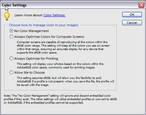
Although there are 4 options, there are basically 2 choices
for grayscale working space: Gray Gamma
2.2 and Dot Gain 20%.
1. No Color Management – When files
are opened after this selection has been made, any embedded profiles are taken
off the file, which is probably a good way to start. The source space in
the Print Preview becomes “Untagged Gray.” The monitor view and
printing on my system are the same as with the second option, discussed
below, because Gray Gamma 2.2 is
the usual default space, including for my Windows XP system.
2. Optimize the image for Computer Screens –
This option uses working space
Gray Gamma 2.2. As noted above, this is the most common standard,
default grayscale space, including for monitors and on the Web.
With this setting one gets a slightly darker monitor image and print,
with somewhat compressed shadow tones. In the darkroom days, it
would have been said to have a “long toe” characteristic curve.
Gamma 2.2 is used by most of the common color spaces like sRGB and Adobe
RGB. I recommend this standard for most, in part, because it is such a
wide spread standard.
3. Optimize for Printing – This is working
space Dot Gain 20% and gives a lighter image with more shadow
separation. In the darkroom days, it might have been considered a “short
toe” characteristic curve. It is similar to the curves I used in the
past and appears to be commonly used in the prepress industry. Images
made with this setting will need further modification for posting on the
web.
4. The final option assumes Gray Gamma 2.2 but allows
No Color Management for files that do not have embedded Gray Gamma 2.2 profiles
in them.
Thus, as a practical matter the first two options in the Elements
4 Color Settings list use working space Gray Gamma 2.2, and the third option
uses Dot Gain 20%. For the most consistency and compatibility, Gray Gamma
2.2 is recommended. For those who have
used my older, non-color managed curves and workflows, Dot Gain 20% will give a
view that is closer to prints with those older workflows.
When an ICC is used in the Print Preview the printer will
match the monitor view for either of these grayscale working spaces. The same ICC is used for both
workspaces. So, to see the differences,
one can open a file with “No Color Management” checked, to remove any profile
that might be embedded in the file, and then go back to Color Settings and
alternate between the options to see the effects on the file.
B. Curves
One of the differences between Elements and full Photoshop
is that image adjustment curves are not supported in Elements. As a
practical matter, this has excluded users of Elements from taking advantage of
the UT2, UT7 and some other inksets where my workflows are mostly based on the
application of curves for controlling image print tones. I also often use curves when I edit an
image. There are a several ways around
this limitation.
With respect to printing workflows, ICCs and the Print
Preview system of PS now or in the near future will allow Elements users to
print variable-tone inksets. For
example, I hope to soon post ICCs that have my UT2 curves embedded in them, and
future variable-tone inksets will be controlled by ICCs primarily. This will allow Elements users to use these
inksets.
While Elements does not support curves directly, Elements
does accept Curves Adjustment Layers (8-bit) if they have been made in full
Photoshop. So, an alternative
method of printing variable-tone inksets is to have the curves put onto
layers. However, the ICC approach, noted
above, is a simpler method.
For illustration purposes, two of the curves shapes I often
use have been put onto layers of small images that can be downloaded from my
web page at http://home1.gte.net/res09aij/Curves_Layers.htm
. The images on the files are screen shots of
the curves dialog box and show what the curve looked like. One of the images is shown on the left half
of the screen shot below.
To apply a curves layer from one file to a working image,
just drag the layer from the Layers pallet, shown here on the right, to the
image to be adjusted. After the layer
is on the working file, the opacity slider on the Layers pallet can adjust the
extent to which the layer affects the image.
The effects of the layer will then be clearly visible.
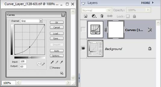
The above curve increases highlight contrast and compressed
the shadows. It will make clouds and
skies look more dramatic. While the
curve is useful, the same result can be accomplish using Levels
(Enhance>Adjust lighting>Levels).
To do the above, push the middle Levels slider to the right.
Another basic curve shape I often use is an “S” curve that
increases midtone contrast without completely destroying highlight or shadow
information (which the Brightness/Contrast adjustments do). The Elements version of this curve is at
Enhance>Adjust Lighting>Shadows/Highlights>Midtone Contrast. Sliding it to the right
gives the “S curve” effect that is often mentioned by photographers.
So, while curves in full PS are more flexible, there are
adjustments in Elements that give the same basic results.
C. Duplicate Image Cloning
What I often do in working up an image is apply the contrast
or other editing adjustment to a duplicate image (File>Duplicate). Then I clone over to my working file only
those parts of the image that I wanted affected. I find this is often easier than selecting
the area to be affected because I can see the effects as I clone over small
areas one at a time with a brush that has a soft edge. If I’ve gone too far or want another effect
next, I undo the curve on the duplicate file, and do the next thing I think I’m
interested in. If the clone tool was set
prior to the edit, the edit can be undone without undoing the clone alignment. So, a series of different adjustments can be
made to different parts of the file rather quickly.
Additionally, I save different versions of the working files
as work up an image, and I try to keep the master scanned file un-changed. As long as I have not altered the cropping of
the image as I work it up, I can always go back to a previous version or the master
file to capture information that may have been lost in an editing step. This is particularly important for retaining
the advantages of 16-bit files. While
many of the tools in Elements are limited to 8-bit files, the original file is,
hopefully, a 16-bit file.
For this duplicate image cloning, I align the clone tool
(set to 1 pixel size) at the (0, 0) or (0.001, 0.001) point – top left corner
of the image – with both images at maximum magnification. The fastest way to magnify the image and get
to this point is to use the Navigator (Window>Navigator). The slider is pushed to the far right and
then the small red rectangle (image area shown) is dragged to the upper left
corner. I use the Information pallet
(Window>Info) to be sure that I’m at the same exact point in both
images. Double click on the
hand tool at the left to return the images to screen size.
The clone tool is limited to 8-bits in Elements. For printing purposes, 8-bits are all one
needs. The advantages of 16-bits include
that one can apply a radical edit and still not run out of discrete steps. That is, the image stays smooth and avoids
the problems of visible stair-steps.
So, the idea is to make adjustments on the original, master 16-bit file,
but then clone the effects wanted over to the working 8-bit file. Due to the limitation of the Elements clone
tool, this has to be done indirectly.
One way to indirectly clone from the 16-bit file to the 8-bit
working version is to first make a duplicate of the working file and set the
clone tool as described above. Then,
because the 16-bit and 8-bit versions should be the same size (no cropping having
been done on working copies), the edits like Levels can be done on the 16-bit version,
that version selected (Select>All), copied and pasted onto the duplicate 8-bit
version. This converts the 16-bit copy
to 8-bit. When the image is flattened
(Layer>Flatten Image) the edits of the 16-bit file (now in 8-bit form) can
be cloned over to the working file. The 16-bit
master file can have the first edit undone, the next adjustment performed on
it, and the effects cloned over using the same procedure, without having to
re-set the clone tool.
D. 16-Bit Files
As noted above, while 8-bit files are fine for printing,
editing can destroy information and reduce the 256 steps of the 8-bit file to
much less. 16-bit files have thousands
of steps. While not usually as many as
the full 16-bits might imply, they nonetheless have much more information, such
that even after the edit there are more than the 256 of an 8-bit file. So, one always wants to start with a 16-bit
(or “high bit depth”) file.
Elements can open 16-bit files, convert 16-bit files to 8-bit
files, but not directly convert an 8-bit file to a 16-bit file. Indirectly, however, this is done by simply
copying and pasting the 8-bit file into a 16-bit blank file of the same size.
I have placed small, blank 16-bit grayscale and RGB files
for downloading here:
http://home1.gte.net/res09aij/Test-files.htm
These can be downloaded, saved and used to convert 8-bit
files to 16-bit files by the above cut and past method. Just make the 16-bit blank file the same
pixel size as the 8-bit file you want to convert. (Image>Resize>Image Size) Note the Pixel Dimensions of the 8-bit file
and, with Resample checked and Constrain Proportions not checked, change the
black 16-bit file size.
One example of when this is useful is if the original image
file is a Jpeg RGB file. These are 8-bit
per channel files. When converted to
grayscale, these 24-bit files become 8-bit files and lose significant amounts
of information. To
avoid losing much of this information, convert the file to 16-bits per channel
and then to grayscale16-bit file.
E. Embedding Custom ICC Profiles
One of
the functions of the full PS that was left out of Elements is the ability to
embed a custom profile into a file. If, for example, one were printing with
the same inkset and printer all the time, it would be easier to just embed the
appropriate profile so that it did not have to be inserted every time in the
printing workflow.
The indirect
way to embed a profile in Elements is to simply copy and paste the file of
interest onto a blank file that already has the ICC of interest embedded in
it. The receiving file must be the same pixel size, but that is easy to
change.
Still,
however, another program appears to be needed to embed the ICC – like full
PS. So far the small free or share-ware
programs I’ve found to do this don’t work well enough to recommend. At this point I don’t see enough reason to
embed ICCs to worry about it. However,
if an easy way to embed appears, it would have some uses.
Links
My
general index of printing information is here: http://home1.gte.net/res09aij/index.htm
My
home page is www.PaulRoark.com
I’ll
be expanding this as I find more tips that will help PS Elements users take
full advantage of the B&W inks and workflows I am involved with.
Happy
printing,
Paul