Digital Black & White
Photography Information Index
www.PaulRoark.com
(Carbon toned with the minimum and best cool pigments to make a neutral print.)
(Carbon toned with the minimum and best cool pigments to make a neutral print.)
(Note also that links to MIS Associates pages throughout my PDFs are mostly obsolete. MIS is simply no longer a supplier of the materials I prefer. Rather, I buy from STS Inks. My contact there is Joseph Costello -- Joe@stsinks.com. The products I use most are the ink formerly known as "Eboni" MK (matte black), which is "wj1082" at STS; Photo Black (for glossy paper), which is wj1122 at STS; and "gloss optimizer" to dilute PK is wj824 at STS.
I currently use an approach to dedicated black and white printing that uses 100% carbon pigments in all but one of the printers' ink positions/cartridges. These carbon inks include both 100% PK and 100% MK, as well as various dilutions of the PK. Additionally, in one ink position/cartridge I have a light blue "toner" that is used to pull the warm carbon image to neutral. The same light blue toner works for both matte and glossy paper.
Why predominantly carbon-based inks? Because it is by far the strongest, most light-fast pigment we have. With indoor displays, these prints will outlive us.
The printing approach I recommend is the most economical, as well as most archival, that I have found. It produces images that range in tone for warm, 100% carbon, to neutral, but still predominantly carbon pigments. This involves an open-source, dedicated B&W inkset that usually involves, at a minimum, individuals loading their own cartridges and also mixing PK with clear (aka "amber") base (aka "gloss optimizer"). Nno scales or fancy equipment is needed.
This is, in my view, today's version of the personal B&W darkroom of the silver print era. My darkroom is now my ink mixing room. If you want the best prints, with the most personal control, and for the least cost, this is it.
I make my profiles available, but this is not a "turnkey" approach for most printers and papers. I publish all that I do, but I am not in the ink or profile business. I am in the fine art B&W print "business" only to the extent that I sell my prints through Gallery Los Olivos, in Los Olivos, California. Of more importance is that I have had a passion for the medium, having grown up with a darkroom and relatives who were artists and photographers. Also, I am determined to keep the very best B&W printing affordable for both myself and others.
For quite some time now, I have used a single B&W inkset for all my printing. See http://www.paulroark.com/BW-Info/7800-Glossy-Carbon-Variable-Tone-2016.pdf for the setup I currently use in my Epson 9800 printer. It should work on any Epson 8-ink printer.
For those in France, thanks to Alain Oguse (oguse@alienor.fr), the 3880 (Eboni based) Carbon Variable Tone PDF is available in French. See http://www.paulroark.com/BW-Info/3880-Eboni-Variable-Tone-01-2017-fr.pdf. A version of the glossy variable tone inkset in French is posted here: http://www.paulroark.com/BW-Info/Glossy-Carbon-Variable-Tone-02-2017-fr_2.pdf" click here.
Universal neutral toner: For both the matte and glossy carbons we are most fortunate that the same light blue toner can be used to make neutral tone prints. I use Canon Lucia Blue and Cyan pigments with generic base c6b for my printing. Third party testing indicates that the Canon Lucia EX color pigments are the most lightfast available. The same profiles work with both the MIS blue toner and the one I use based on Canon pigments. The Canon based toner with carbon, particularlly on the best matte paper, makes what I believe to be the best, most stable, neutral B&W -- more stable than the old silver prints. But 100% carbon is, of course, even more stable.
A single light blue toner, such as those described above, is what I've found is the best compromise between flexibility and ease of use. I have found that very few people can master good B&W profiling of a two-color (cyan and magenta) ink system.
More detail on carbon printing and the approaches is found below.
In the past, we B&W photographers prided ourselves in the archival nature of our lightly selenium toned silver prints. With the advent of digital tools, the inkjet print was, for good reasons in the early days, considered second-rate. Most today still are if one is interested in fine art black and white. While today's best color pigments are very good and better than the "wet darkroom" color processes, those pigments are, generally, not up to the silver print standard. Developing the digital and inkjet processes to achieve "silver print" class image stability and quality has been a significant effort of mine and some other like-minded people.
Today, the best carbon pigment prints we are making from dedicated B&W printing systems have exceeded the silver print
in a number of ways, including image stability.
Just to get your attention, here is a lightfastness comparison of an inkjet 100% carbon pigment print versus a selenium-toned
silver print (fiber base, not RC). The testing was done by Aardenburg-Imaging.com.
The midtone, Lab L = 50 test patch delta-e values
(total change in density and color -- lower is better) after 100 Mlux-hours of light exposure
(about 50 years of display) were as follows:
100% carbon pigment print: Delta-e = 0.1
Selenium toned silver print: Delta-e = 1.2
That is, the carbon print was, by this measure, 12 times more stable than the silver print.
Most of this difference is in the paper tone stability of the substrates. A good inkjet paper that has no
optical brighteners can be very stable. The silver and carbon are both very stable; it is the paper that is
the weak link for the old silver prints.
The point is really to stress that with the right materials -- carbon pigments and good, non-OBA paper -- inkjet prints can be significantly more stable than the classic silver prints. However, the materials and processes are critical when it comes to making the best black and white prints. The higher the carbon pigment content, the better the likely stability. Of course the desired print tone may necessitate some added color, but for stability, that color needs to be held to a minimum and the quality of the color pigments used must be very high.
(See a screen shot of these test reports for 100 Mlux-hours light exposure here. For the full test reports, see Aardenburg Imaging and Archives.)
The visual image quality of, particularly, B&W prints from inkjet printers designed mostly for color printing, and composed mostly of bright color inks, has also been a problem.
A good, appropriately toned, B&W image is best and most reliably obtained by having a B&W printing system that is dedicated to B&W, having carbon inks in most if not all of its channels. I use an approach that has carbon in all but one of the positions (8 carbon inks) and one light blue pigment toner position that offsets the slight carbon warmth to make a totally neutral white. In fact, I have found that a very slight bit of warmth is best and most "neutral" appearing.
In short, a predominantly carbon image is best for B&W, and a printing system made just for B&W printing can make a print that is objectively better than the old silver print technology. The need to serve the mainstream color printing market has made the OEM systems very good at color printing, but for B&W the higher percentage of carbon used by specialized carbon inksets, and the placement of carbon in all but one of the ink positions can provide greater quality at considerably lower cost.
These pages document the printing approaches I have developed and used since the transition from darkroom to digital.
The single most impressive quality improvement I have seen in recent years is AI being applied to sharpening an image.
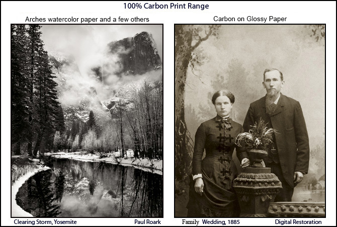
Note that with the 7800/9800 version of this inkset, the toner is in the LLK position. This is because I use the Y position for a second MK. I assume people using wide format professional printers will be comfortable with QuadToneRip. With QTR, dual MK positions are not a problem. With the Epson driver they do limit the flexibiltiy of the system. The only reason for dual MKs in my printing is for Arches watercolor paper, which I, frankly, don't recommend for most people.
The light blue toner is use to neutralize the warm carbon, and is a blend of Canon Lucia Blue (55%) and Cyan (45%) pigments, then this is diluted with the generic base, or gloss optimizer, sold by STS Inks.
In reading my various PDFs, it's important to note that, as new information is developed about the materials we use for printing, my views have changed and may well change again in the future. As such, the dates of my various PDFs as well as my stated preferences here need to be taken into consideration. I try to base the opinions expressed here on the latest information available, including the findings of Aardenburg-Imaging.com, Wilhelm Research, the Digital Print Preservation project (dp3project.org), my own fade testing, as well as many other sources. So far, nothing has come close to the stability of carbon as the basis for modern B&W printing.
For those who expect their prints to be considered worthy successors to the silver (or noble metal) prints, the issue of longevity is very relevant. For those who don't care about long term image stability, the ease and economy of carbon pigment printing may still be enough to make the approaches I recommend worth considering.
I generally mix my own carbon inks using the formulas specified at http://www.paulroark.com/BW-Info/7800-Glossy-Carbon-Variable-Tone-2016.pdf. http://www.paulroark.com/BW-Info/7800-Glossy-Carbon-Variable-Tone-2016.pdf.
One of the most critical problems of the third party blended carbon inks is print tone shifting in very long term display, often to greenish, as one color (magenta) fades more quickly than the other (cyan). See, for example, this comparison of a 100% carbon print versus a typical third party blended carbon plus color inkset after 140 Mlux-hours of light exposure. In my current variable-tone inkset approach I focus on finding the best color inks to "tone" the warm carbon to neutral. This search has caused me to select Canon Lucia EX blue and, now (toner v. 2) the Canon Lucia Cyan (actually somewhat bluish itself) pigments for the toner. The hue angle between them is only 50 degrees, as opposed to the typical hue angle of 120 degrees that separate the C, M and Y inks in the typical color inkset.
See http://www.paulroark.com/BW-Info/LAB-color-wheel-2.jpg for a visual description of the strategy behind this approach. With this smaller hue angle difference, less color is needed to offset the slight yellow tone of dilute carbon, and any differences in fade rates of the color pigments will have much less impact on the image.
The reality is that most inkjet papers will probably fail before the carbon image fades. It is the color pigments that are the weak link. As such, having a small amount of the highest quality color inks makes the most sense if long life is an issue. While 100% carbon is the ideal, most want a neutral print. On the other hand, 100% carbon on Arches watercolor (not inkjet) paper should outlast all of the inkjet prints, as noted below. Arches can be printed with 100% carbon and still have the appearance on the wall of a neutral B&W print.
Good, deep blacks are a characteristic I, like most B&W photographers, expect in a top quality B&W print. When satin paper is displayed without any glass/acrylic over it, the greater dmax of the satine paper type can give a print a significant advantage.
Arches un-coated watercolor papers have an outstanding reputation in the painting world, where they have been used for hundreds of years by artists. And they can make excellent carbon pigment B&W prints. In general Arches is not quite as smooth as coated inkjet papers, but more than adequate for large display prints. Note that the backside of the paper is much less likely than the front side to have fibers sticking out of the surface. While there are other high quality watercolor papers, Arches achieves the highest dmax (deepest blacks) of any un-coated paper I've tested. In fact, Eboni v. 1.1 achieves a dmax that is better than the vast majority of inkjet papers with OEM MK. That said, Arches requires two MK ink positions to reach its dmax. Because I use QuadToneRip and fill my own printer inkcartridges, it is not a problem for me. With no coatings or laminations to crack or flake off, these un-coated watercolor papers are likely to age much better than coated inkjet papers. While I suggest this paper as a benchmark, and I use it, uncoated watercolor papers require special workflows and inks to make good images. They are not what I recommend for most people. There are many very good inkjet papers. The best matte papers look excellent and will last a very long time with proper handling and display. I note and profile many of these in the various PDFs I have posted on printer and ink workflows.
Dyes and pigment (particularly carbon pigs) are separate B&W photographic media for different aesthetics and markets. While the B&W dye print on my office wall looked good after 3 years, but when the frame was removed and pigments under the frame were revieled, the fading of the image looked serious. These dyes should not be considered "fine art" suitable for collectors or any serious, long-term display.
Note also that B&W images made with dyes can display color shifts when viewed under different lighting conditions. This was mostly a problem with old-style fluorescent lights. Older lights with Color Rendering Indices (CRI's) of less than 80 may result in a green/cyan tone shift that is significant.
I have made B&W profiles for the Epson 1400 and its OEM Claria inks, using QTR, and have outlined my recommended approaches in a PDF at http://www.paulroark.com/BW-Info/1400-Claria-BW.pdf.
Workflow Notes;
"Carbon on Cotton" for best image stability and low cost;
Digitizing B&W film negatives;
Why Dyes;
MIS 100% carbon pigment inksets;
-- Eboni-6 for smoothness;
-- Eboni-6 details, including for the 1400;
Ink Mixing, including for Carbon-6, HP, and dyes; for former darkroom workers and others so inclined;
High Sierra Workshops at the historic Golden Trout Camp;
Paul Roark
Solvang, CA, USA
www.PaulRoark.com